[ad_1]
The first image you see when you walk into the exhibition at the National Portrait Gallery is the last portrait Michael Jackson commissioned of himself before he died in 2009.
 |
He didn’t live to see the finished picture, but I think he would have liked it.
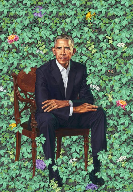
It is by Kehinde Wiley, the American artist who, to much fanfare in February, revealed his official portrait of Barack Obama to the world. It depicted the ex-President sitting in a mahogany chair surrounded by foliage and flowers looking headmasterly.
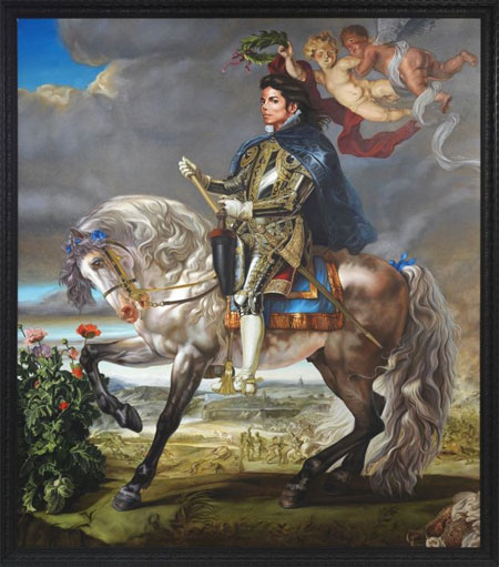
Wiley’s Jackson portrait also sees the subject sitting, along with an equally stern expression and a smattering of decorative flowers. But there the similarities between the two paintings end.
 |
|
Equestrian Portrait of Philip II (Michael Jackson) by Kehinde Wiley, 2010 — Photo: KEHINDE WILEY
Barack Obama by Kehinde Wiley, 2018 — Photo: NATIONAL PORTRAIT GALLERY, SMITHSONIAN INSTITUTION
|
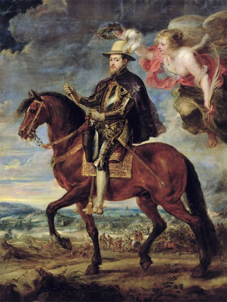
Obama is presented as a quintessentially modern man, while the pop star is on horseback dressed like a medieval knight on a huge canvas that is a very direct riff on a 17th Century painting by Peter Paul Rubens of Philip II of Spain, as its title makes plain – Equestrian Portrait of King Philip II (Michael Jackson).
 |
|
Philip II on Horseback, 1629 – 1640, by Rubens — Photo: PRADO
|
It’s not a patch on the original Rubens in terms of quality, but it is absolutely perfect for this freaky show, which takes a look at Michael Jackson’s extra-curricular role as a muse for contemporary artists.
Wiley typically makes paintings that place the “black body” into art history’s almost exclusively white western canon. So, inserting Michael into Rubens’ heroic painting of a Spanish monarch fits very nicely.
As for Jackson, well, he had an insatiable taste for the baroque, which he sometimes sated with a shopping spree to buy some horrendously kitsch Louis XIV-type modern ornaments, or – as in this case – by developing a keen interest in the work of Rubens.
It is the exhibition’s most resolved alignment of the individual tastes and concerns of both artist and sitter – a piece of classically inspired pop art that became, during its creation, a fitting and poignant memorial portrait of perhaps the greatest entertainer of our time.
According to Wiley, the full body armour the singer is wearing in the painting alludes to Jackson’s public image and the way it “functioned at once as communication and armour.”
The fighting in the background refers to the battles he fought throughout his life: with his recently deceased father, with the media, with his own demons.
The flowers are the beauty of creativity and music, while overhead, the cherubic figure of Victory holds a laurel crown to place on the head of the King of Pop.
It is a fantasy world, like Neverland his 2,700-acre ranch in California, in which he could keep the real world at bay.
It is a weird, sad painting, which in no way matches the subject’s extraordinary creative and technical accomplishments but somehow sums up his life.
It also sums up the exhibition, which is a very strange affair.
 |
|
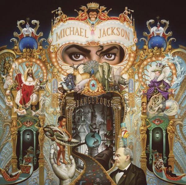
Dangerous by Mark Ryden, 1991 — Photo: MARK RYDEN/PAUL KASMIN GALLERY
|
It is not a chronology of Michael Jackson’s life, nor does it seek to tell his story. It is just a gathering together of random contemporary artworks that are united by the simple fact that they depict the late singer in some way, shape or form.
Actually, barring a few notable exceptions, they are also united by a lack of quality.
Wall after wall is adorned with not very good art, some of which is by very good artists. Maybe they never intended their Jackson homage to be seen in public, maybe they were star-struck. I don’t know, but when you walk round you’ll see what I mean.
There are some notable exceptions.
 |
|
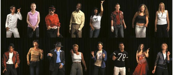
King (A Portrait of Michael Jackson) by Candice Breitz, 2005 — Photo: KAUFMANN REPETTO/KOW
|
Candice Breitz’s 16-channel video, in which we watch a line-up of 16 screens with each one featuring die-hard German fans singing their way through Thriller, track-by-track. Now That’s What I Call A Portrait.
And then there is Appau Junior Boakye-Yiadom’s sculpture made out of 20-plus helium-filled balloons that butt up against the ceiling while the ribbons with which they have been tied lead to a pair of penny loafer shoes held up en pointe; balancing in the moment as Jackson did in his famous “freeze” dance move.
Nearby is Time Can Be A Villain Or A Friend by Hank Willis Thomas. It is an appropriated image from a 1984 edition of Ebony Magazine, which shows an imagined version of how Michael Jackson might look like in the year 2000. At first, the fact that they got it so hopelessly wrong is funny, and then it isn’t.
The elephant in the room – or chimp, I should say – is that the curators were unable to loan any one of the three or four versions of Jeff Koons’ famous sculpture Michael Jackson and Bubbles. That’s a bit like not having Pele in the best ever Brazilian soccer team, or cutting a chapter out of Great Expectations.it leaves a big hole in the show.
But despite that necessary omission (wittily acknowledged by the curators with a prominently displayed photograph of the sculpture by Louise Lawler, and a satirical take on it by Paul McCarthy) and a scrapbook feel of the display, it is an affecting exhibition.
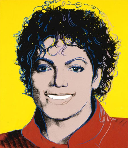
We bear witness to a sensitive, creative young boy becoming a commodity to be exploited: a Warholian product of popular culture whose soul is used like the fizz in bottle of Coke to add a little sparkle in the lives of thirsty consumers.
 |
|
Michael Jackson by Andy Warhol, 1984 — Photo: THE ANDY WARHOL FOUNDATION
|
That’s the truth this show tells. Michael Jackson’s role was to sit in his gilded cage until he was wanted by someone to sell records, or magazines, or art, or – as is the case here – exhibition tickets.
Source: BBC
[ad_2]
Source link
